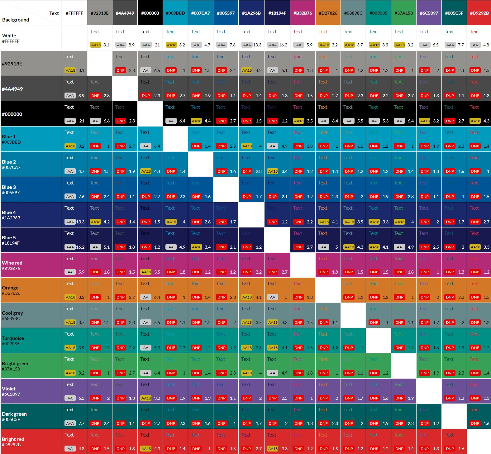
When using our brand colours on the web, you need to ensure the contrast between multiple colours is high enough.
For example, Blue 1 (#009BBD) on a white (#FFFFFF) background isn't accessible unless you're using large text.
Refer to our colour contrast grid to ensure you're using an accessible combination of colours.